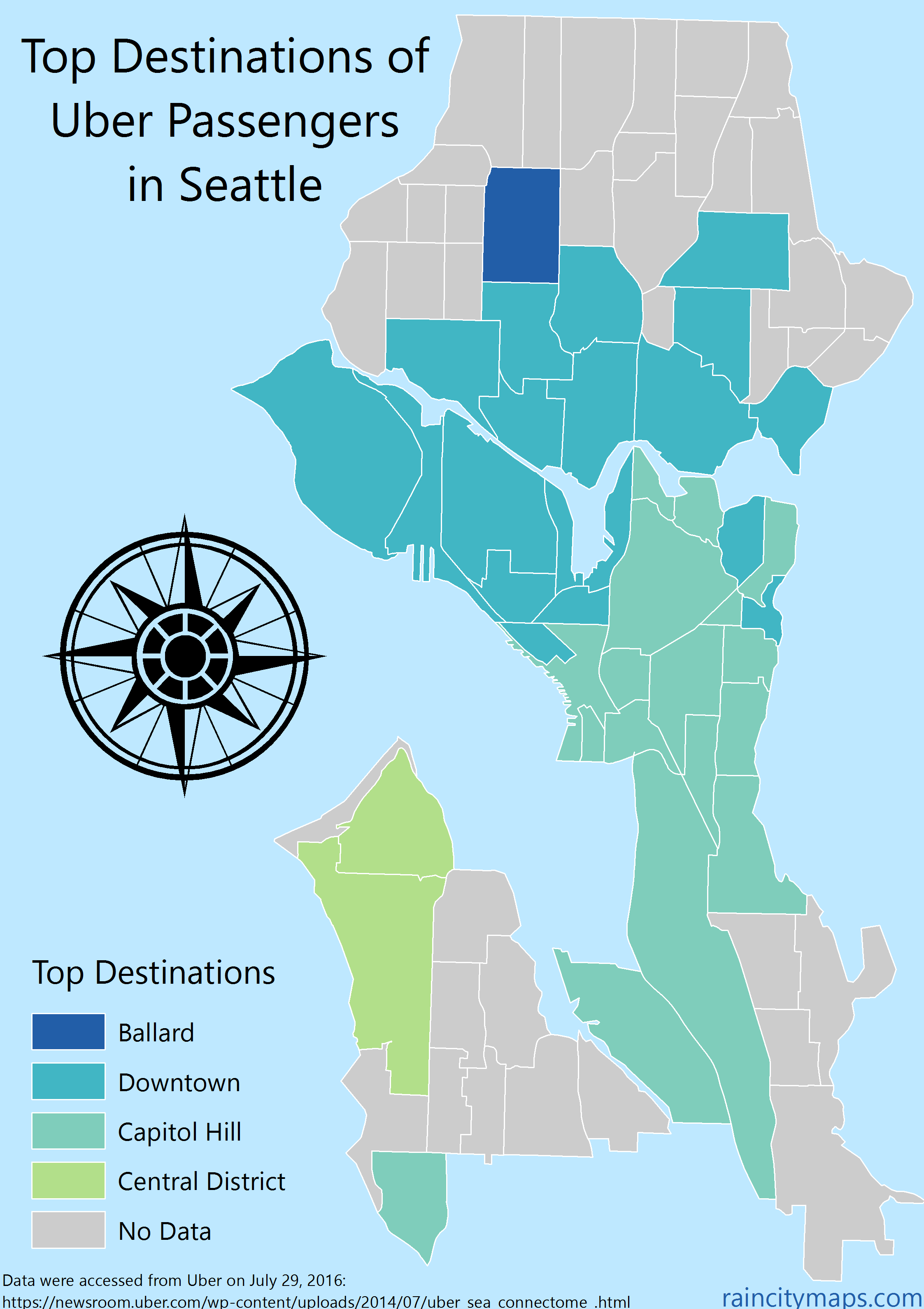
The above map shows the top destinations for Uber riders by neighborhoods from where the rides began. Mouse over the image to see a second map: a cartogram that distorts neighborhood size based on the proportion of Uber passengers (out of all Seattle Uber passengers) starting from that neighborhood.
The data show how Uber riders gravitate towards the urban centers, even if they're already close to the middle of things. Even people starting in Capitol Hill take Ubers to Capitol Hill most often. Also, the map shows an interesting divide between North and South Seattle: Northerners more often go Downtown while Southerners tend to visit Capitol Hill.
A couple of warnings: Uber doesn't give open access to their data, so I took the data from the source code from a public map that they made in late 2012, so things are almost certainly different now. Also, Uber's map did a much better job showing the complexity of urban movement, and paints a much more realistic picture of how people move about cities, but I found that it had too many lines to make sense of what is happening, so I created a simpler version.
Data:
The source code of this map
